The home kits looked to tradition and the away kits went retro. The third kits are where Serie A clubs take more risks.
Here are the alternative tops the Italian top-flight teams will be wearing this season.
AC MILAN – Black is back. Puma’s third kit has a black base with fluorescent red details that react to UV light, so the shirt changes character depending on how it is lit.
The concept is ‘Rossoneri in a new light’. It was launched in Jakarta, during the club’s pre-season tour of Indonesia, which is home to one of the biggest Rossoneri fan communities in the world.
ATALANTA – The home kit took its lead from the stadium and the away kit from the early 90s. For the third, Atalanta have gone up the hill to Città Alta, the old upper town.
The shirt is a warm beige called toasted sesame, with black and taffy blue trim and the club’s 1964 crest. Its geometric pattern is inspired by the Meridiana, a giant sundial set into the floor under the arches of the Palazzo della Ragione in Piazza Vecchia, where a beam of sunlight marks midday. Take the funicular up from the lower town to see it for free.
BOLOGNA – The Rossoblu completed the hat-trick of tributes to their famous stadium after also marking 100 years of the Dall’Ara on this season’s home and away kits.
The pattern across the front of this one is made up of the motto ‘we are one’, the club crest and, of course, the Maratona Tower.
And the kit is gold. What’s not to like?
CAGLIARI – ‘To the Future – Beyond Time’ is a sand and black shirt from EYE Sport. A tonal spiral runs across the body, the sleeves have a pattern of linked triangles, the hem is finished in gold and the black crest shows only the Four Moors.
The campaign was shot on Sardinia’s west coast, at the Giovanni Marongiu Civic Museum in Cabras, home of the ancient Giants of Mont’e Prama, and on the Sinis Peninsula. The shirt is made on the island, at the EYE Sport factory in Cagliari.
COMO – Watch this space. Nothing official yet, but we’re expecting it very soon.
FIORENTINA – No regular third kit yet, but the Viola have a special shirt for the club’s centenary.
It is half red, half white, like the first Fiorentina shirt, which joined the white of Club Sportivo Firenze and the red of Palestra Ginnastica Fiorentina Libertas. Black details on the collar finish it off, and the crest is the one from 1926: a red lily on a white shield. Only 1926 shirts were made.
FROSINONE – Frosinone released all three of their 2026-27 strips together in August, made once again by Zeus.
The third shirt is dark navy, with bright yellow logos and yellow and blue detail around the collar. It is a simple design, and works well next to the dominant yellow of the home kit.
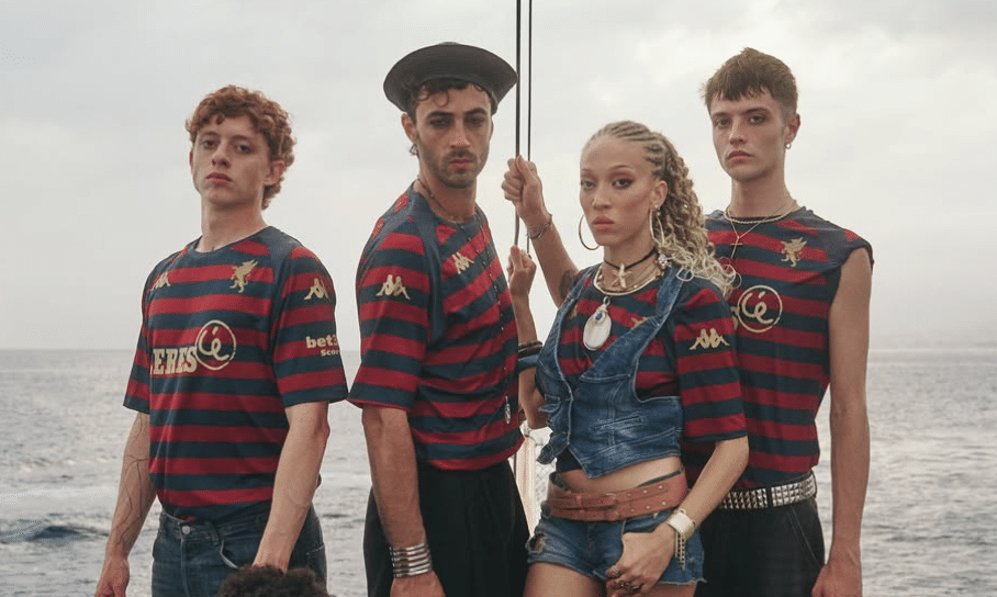
GENOA – Italy’s oldest club launched this one on September 7, the day of its 133rd birthday. The red and blue are still there, but in horizontal hoops, and a Union Jack sits on the back in honour of the club’s English founders.
The gold griffin on the chest comes from the crest of the 1990s, and the campaign stars a young pirate crew at sea. The night before, thousands of fans celebrated in Boccadasse, the old fishing village at the eastern end of the Corso Italia seafront.
INTER MILAN – Nike went back to the 1997-98 third shirt. The base is a dark grey called iron ore, with a wide black band across the chest, a blue stripe and yellow for the Swoosh, crest, names and numbers.
The launch campaign was shot in places that capture everyday football culture in Milan: a bar, an oratory and an Osteria. These are the communities and spaces that keep shaping the bond between the club and the city.
JUVENTUS – After pink for the second kit, Juve go black and gold. The concept is ‘We Are Youth. Since 1897’, taken from iuventus, the Latin word for youth behind the club’s name.
Tonal flames run through the black base with a Y2K feel, and the three stripes, adidas logo and crest are in gold. Black shorts and socks carry the same gold details and flame graphics.
LAZIO – The kit was launched by surprise with the home shirt on July 2, through a video on the club’s channels.
The shirt is navy with gold details, and the club calls it its boldest and most urban kit. The texture is inspired by the mosaics and the ancient paving of Rome.
There is a polo collar with buttons, and SSL900, for the year Lazio were founded, sits on the back of the neck.
LECCE – Blue returns for the third shirt, a colour long linked to Lecce’s alternative kits. Red and yellow trim runs around the collar and cuffs, and the adidas three stripes are yellow on the shoulders.
This is Lecce’s first season with adidas after making their own kits, and blue shorts and socks complete the look.
MONZA – The third kit brings back one of Monza’s best-known symbols: a vertical red band edged in white, running down the front of the shirt and carrying the crest. Here it sits on a black base, with a clean tonal collar.
After the home and away launch told the story of Brianza’s villas, this one turns to motorsport, with a campaign shot in a racing setting. It is a nod to the Autodromo Nazionale, the ‘Temple of Speed’ inside the Parco di Monza, just north of the city centre. Home of the Italian Grand Prix, it has carried Monza’s name around the world.
NAPOLI – Napoli have two third kits this season. The red ‘Tutto il Rosso di Napoli’ arrived in August, 40 years after the first Scudetto season of 1986-87, with the crest and EA7 logo swapped as on old shirts.
In October came the navy and gold Third Kit Euro for the European nights. Woven into its fabric is the Corsiero del Sole, the unbridled horse that has been a symbol of the city since ancient times. It was also the club’s first emblem in 1926, before the donkey took its place as Napoli’s mascot.
PARMA – Black with pure pink details, and made for the young. The shirt marks the road to 2027, when Parma becomes European Youth Capital, with a full year of events and projects created with and for young people.
The programme is built around eight themed piazzas, from food and the city’s renaissance, to the Piazza of inclusive sport, where accessible and Paralympic sport takes centre stage.
The mandarin collar and trim are pink, and ‘Writing Our Future’ is on the back in graffiti style.
ROMA – The home kit was Virtus and the away kit was Pietas. The third is Fides, the Roman virtue of loyalty and unity.
The shirt is dark grey, with woven details that frame the crest and the adidas logo in yellow and red, and the traditional crest sits in the centre of the chest. On the back of the neck is ‘LOTTA CON IL CUORE’ – fight with heart – an old rallying cry of the Roma fans.
Paulo Dybala and Roman actor Edoardo Leo starred in the launch video.
SASSUOLO – This kit’s colour is is Electro Royal, the blue of Mapei, the company that has backed the club for more than 20 years.
Thin white vertical stripes come from the ones in the club crest. It was presented on September 23 at the Mapei stands at Cersaie, the international ceramics fair at BolognaFiere, in the Fiera district north of Bologna’s centre.
TORINO – After the Basilica of Superga on the home shirt and River Plate on the away, the third kit comes down into the city.
It is dark blue, a colour that returns to Torino’s third kit after several years. An embossed pattern inspired by the Mole Antonelliana covers the shirt, with turquoise details and a touch of granata on the collar and sleeves. The slogan is ‘È questione di eleganza’ – It’s a question of elegance.
The Mole stands in the city centre and is home to the National Museum of Cinema.
UDINESE – For the fourth year in a row, Udinese took their third kit to Milan Fashion Week. The launch was on September 22 at DropCity, the design centre in the old warehouses under the arches of Milano Centrale station.
The shirt was designed by Giuseppe Buccinnà for the club’s 130th anniversary, inspired by an imagined meeting between photographer Tina Modotti and poet Pier Paolo Pasolini.
The base is cream with black and gold, and the original star crest returns to the chest. On the back of the neck is ‘FUARCE UDIN’, Friulian for Forza Udinese.
VENEZIA – The third shirt, released on September 3, is red, black and gold, and draws on one of the best-known red kits in the club’s history.
It brings a new alternative crest, a modern take on the Winged Lion of Saint Mark, which will sit alongside the current badge. The red fabric hides nautical signal flags that spell VENEZIA, a nod to the city’s life on the water. Black shoulder panels, a polo collar and gold details frame the shirt.
Serie A Home Kits 2026-27… When Football and Fashion Collide
Serie A Away Kits 2026-27: The Good, The Retro and the Seriously Stylish
Related Topics
Related Articles
Related Articles
It is in Foggia that you can truly live and breathe the slow-paced, southern Italian way of life.
A top-of-the-table clash between Mantova and Palermo headlines the latest triple-header of Serie B fixtures live on Destination Calcio TV.
The team had a miraculous escape several years ago and has a claim to being Calabria's oldest club.