
Serie A Away Kits 2026-27: The Good, The Retro and the Seriously Stylish
By Editor DC
From Milan’s Athens tribute to another fantastic fashion statement in Venice via a couple of stops in South America, the Italian top flight has outdone itself this year with the 20 kits the teams will be wearing on the road.
Here are Serie A’s away strips for the season.
AC MILAN – After Istanbul, there is always Athens. This was a quite brilliant launch of an away kit as Milan brought in Pippo Inzaghi to unveil Puma’s latest white design. Inzaghi scored both Rossoneri goals in the 2007 Champions League final win over Liverpool in Greece, to gain revenge for their defeat in Istanbul two years earlier.
ATALANTA – For the 2026-27 home kit, Atalanta took inspiration from their ultra-modern New Balance Arena. For this one, they looked a bit further back. “The away kit draws inspiration from designs worn in the early 90s, a period our supporters remember with great affection,” said Romano Zanforlin, Atalanta’s commercial and marketing director. “Those designs remain hugely popular, and we are delighted to bring them back in a contemporary version while preserving their spirit and connection to the club’s history.” Anybody else see hints of the top West Germany wore when they won the 1990 World Cup in Italy?

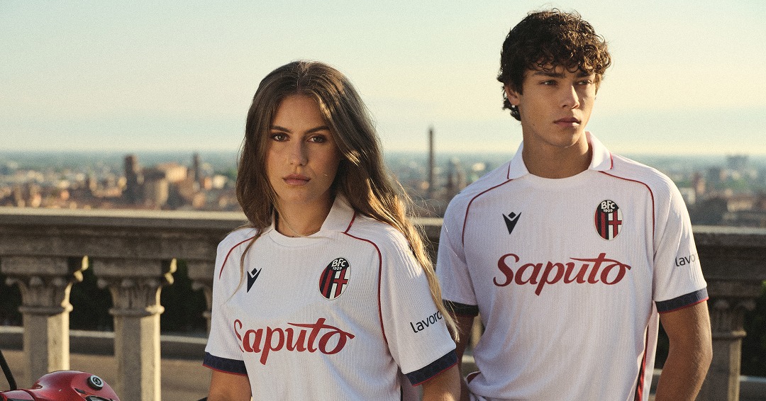
BOLOGNA – Simply beautiful or beautifully simple? This white number is up there with the very best of the season’s away kits. The collar makes it stand out and, like the home kit, the Maratona Tower is present – this time in blue – on the back, just below the neck. The Church of San Michele in Bosco was the venue for the launch, up in the hills around Bologna with magnificent views over the city.
CAGLIARI – This one arrived a few months ago, before the end of last season, but it remains one of the more unusual and impressive calcio kit unveilings of the summer. The launch was a collaboration with the Cagliari Crusaders as the top, predominantly white with touches of red and navy, was inspired by the style and look of American football jerseys. And it made a winning start when the Islanders beat Torino 2-1 in May.
COMO – Another innovative launch, this time with the club letting their players take the lead. Assane Diao, Lucas Da Cunha, Jacobo Ramón, Yan Couto and Jesús Rodríguez were given disposable cameras as the team left for the UK to face Premier League champions Arsenal in London, before taking on Liverpool at Anfield in preparation for the campaign ahead. The pictures looked amazing, and as for the kit… with thin stripes, a classic collar and the iconic adidas Trefoil, what’s not to like?
FIORENTINA – To celebrate their centenary, Fiorentina launched their home and away kits at the same time, in the spectacular setting of the five-star St Regis Hotel, on the banks of the River Arno. Fittingly, the away top is where “elegance, identity and tradition meet,” and the standout feature on this jersey is the iconic lily pattern woven throughout.
FROSINONE – A calm contrast to the dominant yellow home shirt, the Frosinone away kit has an off-white, weathered base, a classic polo collar and a subtle but beautiful navy and yellow trim in the club’s traditional colours. The badge really stands out on this shirt, which was released alongside the home and third kit in the last Serie A release of the summer.
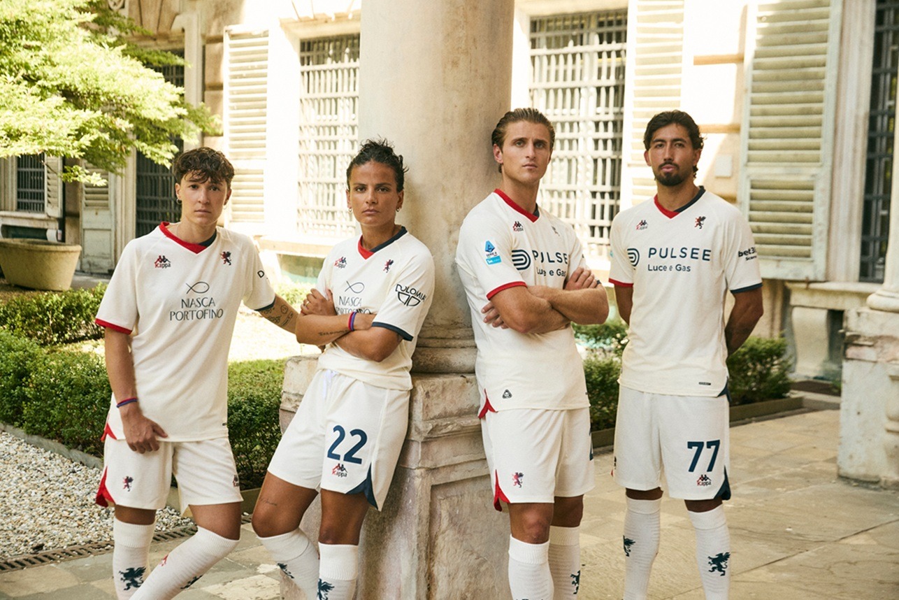
GENOA – It was around this time last year that Genoa celebrated their English roots by dropping an away kit with a huge St George’s Cross on the front, and while this year’s is more subtle, it is another jersey with distinct ties to the club’s past. Before they wore the famous red and blue, the first Genoa team played in white, hence the Back to Back: Since 1983 campaign to unveil this one. Keeping it local, the launch took place at the Strada Nuova Museums, while the video was narrated by Mauro Pirovano, a Genoese actor, comedian and theatre director.
INTER – The Serie A champions lived up to their billing, with a kit launch sprinkled with stardust. New York was the setting, Christian Vieri was centre stage and baseball was the inspiration. This away kit looks like a Yankees top with thin stripes on a white background, while the finer details are something special. The Inter badge, for the first time, has been reimagined as a monogram. There is also a matching jersey, jacket and cap. It’s a home run for this away collection.
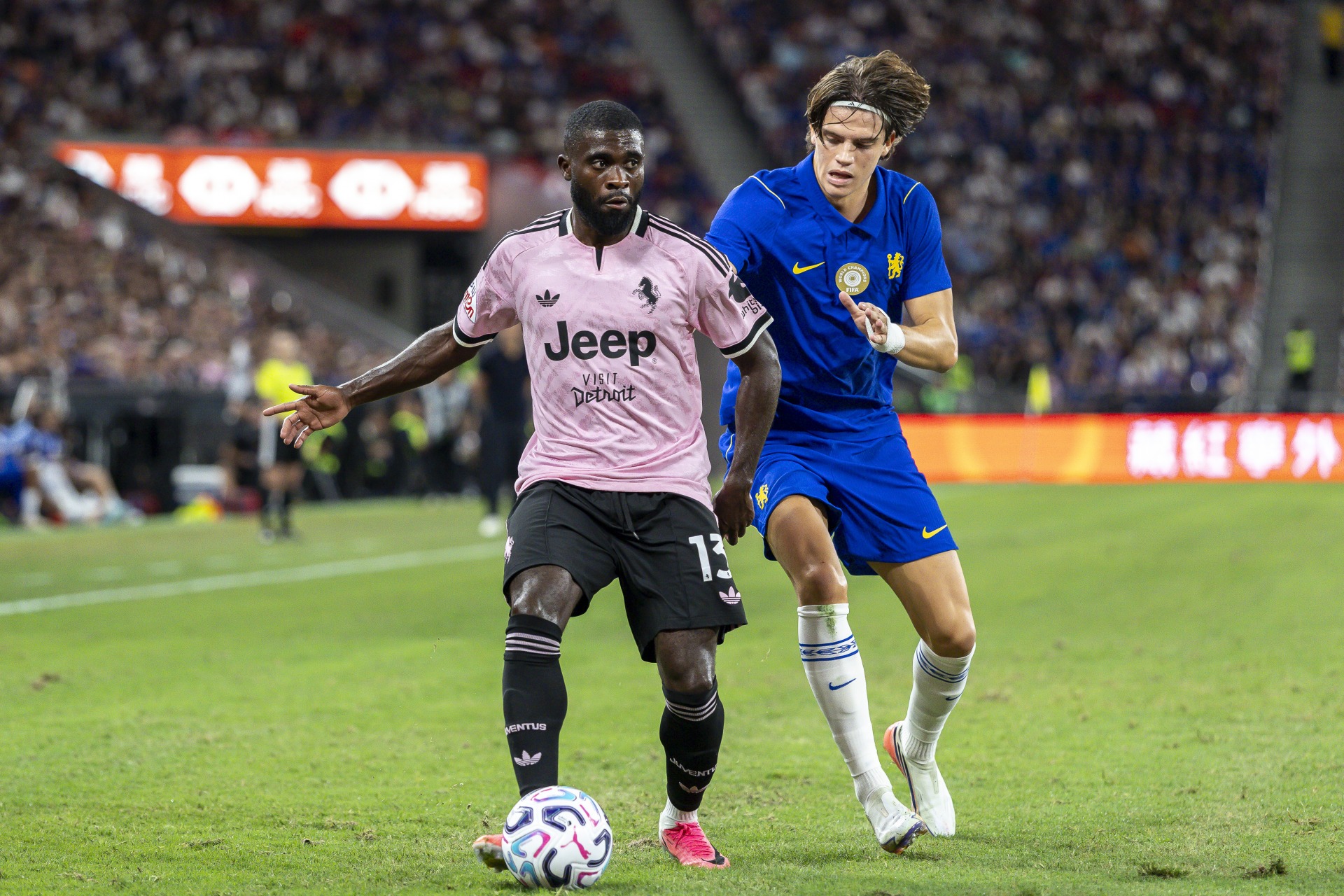
JUVENTUS – Like Genoa, Juve went right back to their roots for the away kit, going for their iconic pink, which they wore in their early years before the black and white. There was no huge physical launch for this one; perhaps they were letting the strip make its own mark. The colour works, the adidas Trefoil always looks good, and the zebra pattern embossed on the fabric is a lovely touch.
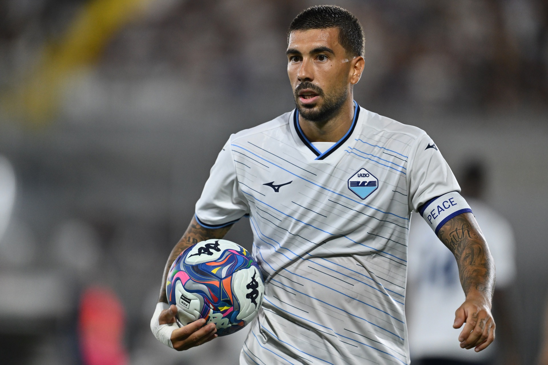
LAZIO – The blue half of Rome have gone for a retro look with their away kit, but without leaning as far back as the likes of Genoa and Juventus. They have taken inspiration from striped kits from the past but opted for a modern twist – diagonal lines across the jersey, varying in thickness. They’ve also gone for the traditional crest, which had not been used for almost 40 years.
LECCE – The adidas away kit for Lecce in 2026-27 is absolutely stunning, and it weaves the identity of the club into the fabric. The Giallorossi, or red and yellow, colours are featured across the chest, collar and cuffs. Shot in style with the city as a backdrop, Lecce certainly look the part this season.
MONZA – This may be almost a mirror image of the home kit but that doesn’t take away from how good it is. In their first season with the club, Nike reversed the colour scheme with this white shirt and red collar, while taking inspiration from the strip worn during Monza’s promotion to Serie B in 1951. This one dropped at the same time as the home top, with images of the kits at landmarks throughout Monza and Brianza.
NAPOLI – Long after Diego Maradona made sure Napoli’s bond with Argentina will forever be unbreakable, Buenos Aires became the setting for the launch of their latest away kit. The campaign was shot at iconic locations in the Argentine capital, such as La Boca, Caminito, Puente de la Mujer, the Casa Rosada and Plaza de Mayo. So, of course, the top just had to be white with light-blue stripes.

PARMA – Shaped by the City was the concept behind the launch of the Parma away kit. It was inspired by the city’s urban spaces, and the pattern all over the jersey represents Piazza Garibaldi, which is about a 15-minute walk from the Tardini, as well as piazzas up and down the country. This top is similar to last year’s but certainly a step up.
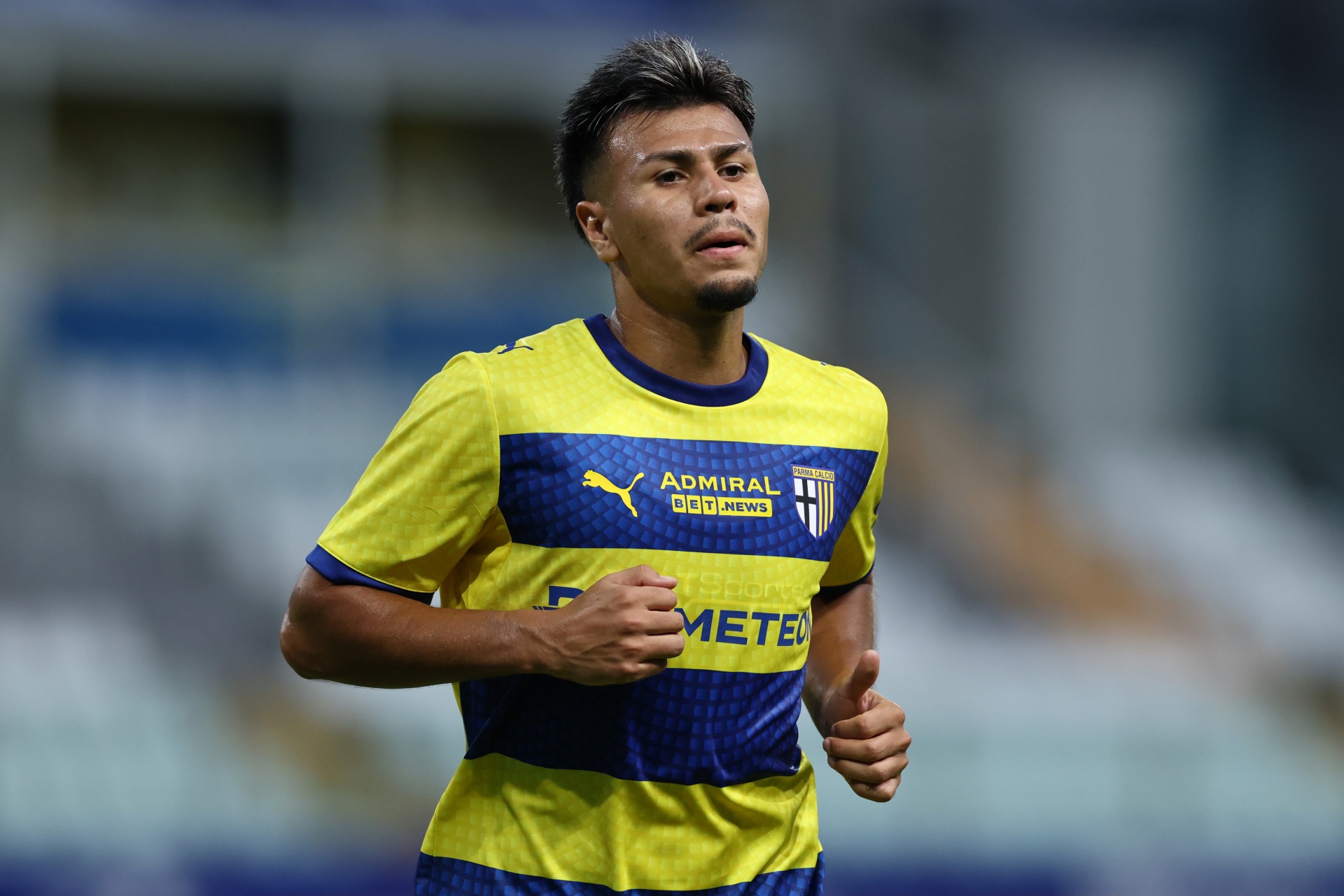
ROMA – Pietas – the Roman virtue of loyalty, devotion and duty – was the main theme when Roma released this stunner of an away kit, but stealing the show were the adidas Trefoil in the middle of the chest and a crest that had not been used since the 1940s.
SASSUOLO – The Sassuolo home kit pays homage to the smoke of the ultras’ flares, but the away kit looks to the landscape. The jersey has a super-clean base, off-white covered in a subtle floral pattern that you can only see up close. The look is enhanced with the green trim on the sleeves and collar, while the design pays tribute to the daffodil, a historic symbol of the city representing rebirth and rooted in its origins.
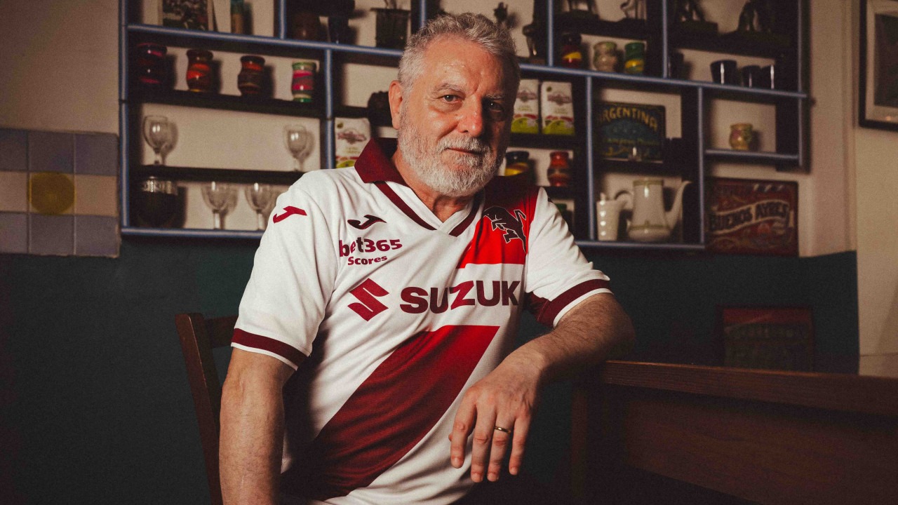
TORINO – It may look like a packet of Embassy Filters, but this absolutely smoking kit from Joma is another Serie A number with a South American link, as Torino’s away top celebrates their Eterna Amistad (Eternal Friendship) with River Plate. The top has the Argentine side’s famous red sash, starting from the bull by the left shoulder and fading into the Granata colour as it moves down and across. As well as celebrating Torino’s 120th anniversary, it also marks 125 years of River Plate. The teams have shared a bond since Los Millonarios played a charity match at the Stadio Comunale in Turin in the aftermath of the 1949 Superga tragedy.
UDINESE – This blue away kit was launched by the sea, at the Isola d’Oro resort just over 30 miles south of Udine. Yet, the design speaks to the mountains as well as the Adriatic and, importantly, continues an Udinese trend of promoting the region as a whole, rather than just the city the team plays in.
VENEZIA – It feels like every year we have to gawk at the new Venezia home kit, only for the away shirt to come out a few weeks later and give it a run for its money. So, here we go again. With NOCTA at the controls, Venezia keep getting it right, and to show off this one, model Kat Qiu pulled it on and two Venezia fans acted as her bodyguards as she strolled through Venice. The city is also on the top, with the arched VENEZIA across the chest representing one of the bridges. There is also a version with the Cynar Spritz sponsor on the front.
Related Topics
Related Articles
Related Articles
For over a decade from 1991 under the volcanic Luciano Gaucci, there was never a dull day in Perugia.
It is a speck on the radar, tucked away in the Tuscan hills at the southern end of the Siena province on the slopes of Mount Amiata.
An aristocratic city famous for its art and education against a coastal, working-class port town.