

Italian football has a long-standing reputation of producing classic kits.
From traditional designs reimagined to some truly spectacular unveilings, it has been an exciting summer waiting for the latest drop from every team.
Here are the home jerseys all 20 of them will be wearing over the campaign.
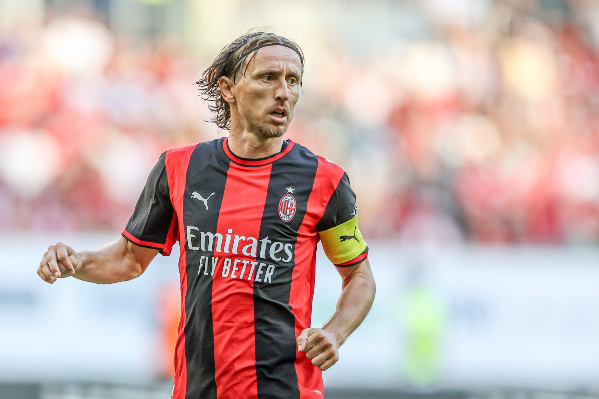
AC MILAN – At Destination Calcio, we love it when a Serie A team rekindles the glory days of calcio, and Milan have done just that with the design of their latest home jersey.
They’ve gone back to a more straightforward style of red and black stripes, and with the red trim on the sleeves and collar, this has shades of the one they wore in 1998-99.
ATALANTA – It is no secret that the New Balance Arena in Bergamo is one of our favourite grounds, and Atalanta’s home is represented in the stripes of their new home kit.
At first glance, it might seem like just another black-and-blue vertical pattern. But if you look closely, the detail is inspired by the architecture of the stadium.
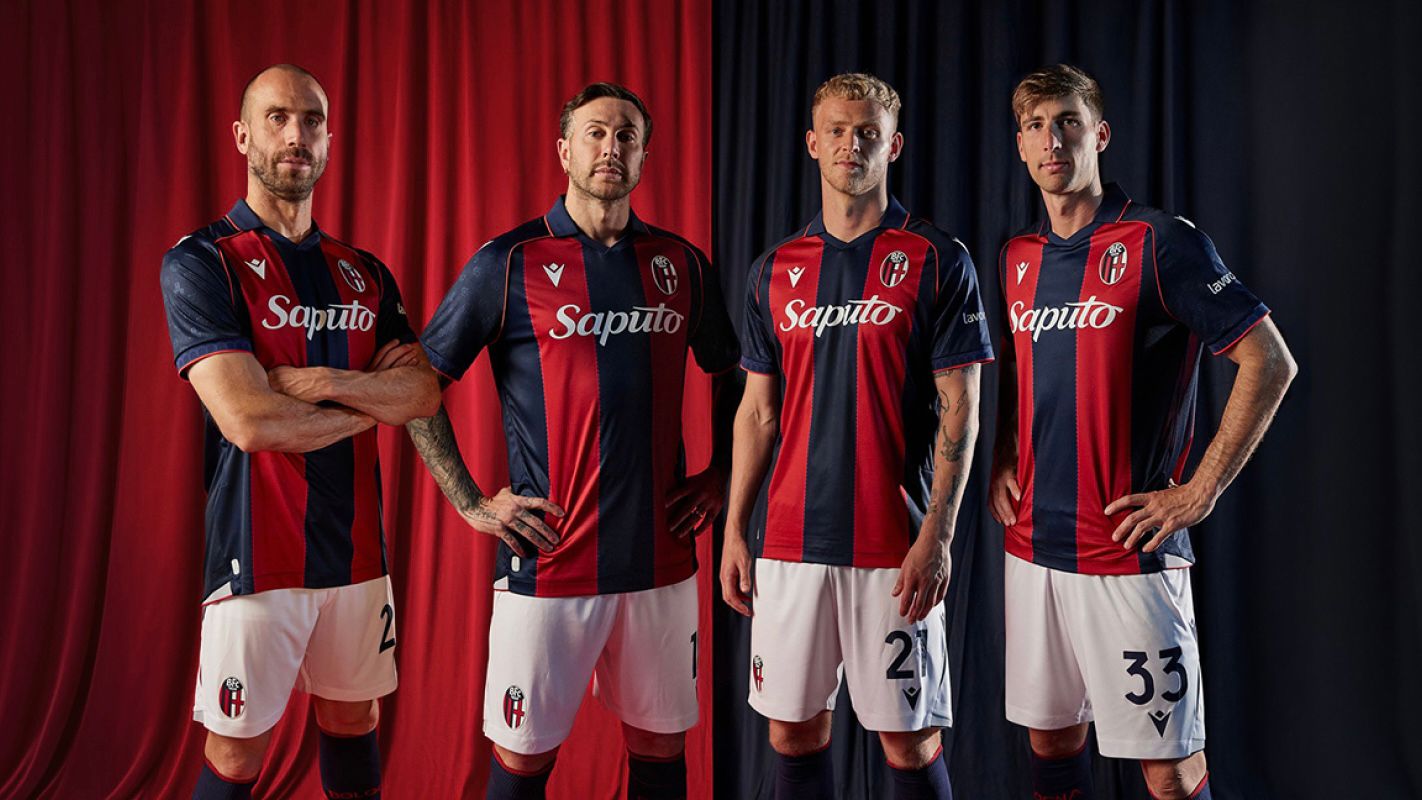
BOLOGNA – Like Atalanta, Bologna are honouring where they play on their new shirt, but while the boys from Bergamo are celebrating something relatively shiny and new, it is the 100th anniversary of the Stadio Renato Dall’Ara being marked by the Rossoblu.
The stripes are separated by small, shadowy versions of the famous Torre di Maratona, one of the most recognisable architectural features on the calcio landscape, while Bologna’s beautiful porticoes appear on the sleeves.
CAGLIARI – We actually prefer Cagliari’s away kit – it’s a bit different and has a flavour of American football – but that is for another article.
There’s still a lot to like about the home jersey though. This is the only one in the league made by EYE Sport, and you can’t really go wrong with that classic half-and-half design.
The message at the launch in July was ‘Shapes of Legacy’ which is basically their heritage meeting modern design. It works, and the magnetic button on the collar is a nice touch.
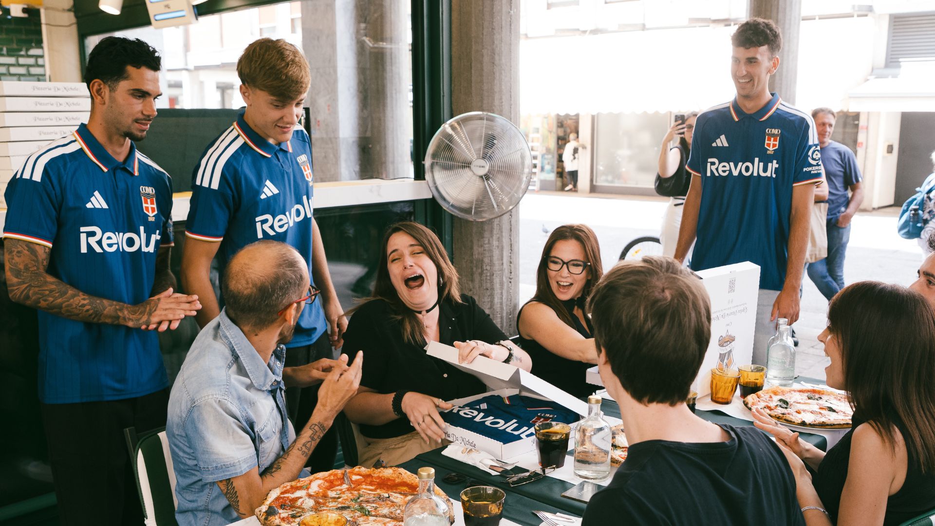
COMO – This stunning new home kit, designed by Rhuigi Villaseñor, was matched by the launch in the heart of the city, which included players Lucas Da Cunha, Jacobo Ramón and Jesús Rodríguez handing out the top, along with pizzas, to fans in the city.
From restaurant workers to ferry staff on the lake, the people of Como got their hands on the strip before the team wore it at the Como Cup.
The subtle stripes, polo-shirt collar and ‘Semm Cumasch’ on the back make this one an instant classic. Their best kit for years.
FIORENTINA – In the city of Renaissance masterpieces, the concept behind this kit launch was Anche l’arte si indossa – Art can also be worn.
It was at the five-star St Regis Hotel, on the banks of the River Arno with views of the Tuscan hills, that Fiorentina keeper David de Gea and his team-mates posed for the big reveal to mark the club’s centenary.
Joma have returned as manufacturer, replacing Kappa for the club’s milestone. As for the hotel, Destination Calcio has made a note to check it out.
FROSINONE – Frosinone’s modern take on a traditional design sees the squad return to Serie A in ‘dominant yellow’ style.
Look closely, and you will see some incredible detail in this home jersey, like the gothic ‘F’ emblem on the back of the neck.
In true Italian fashion, the release of this kit came very late. Frosinone released all three 2026-27 strips together just a few weeks out from the start of the new campaign.
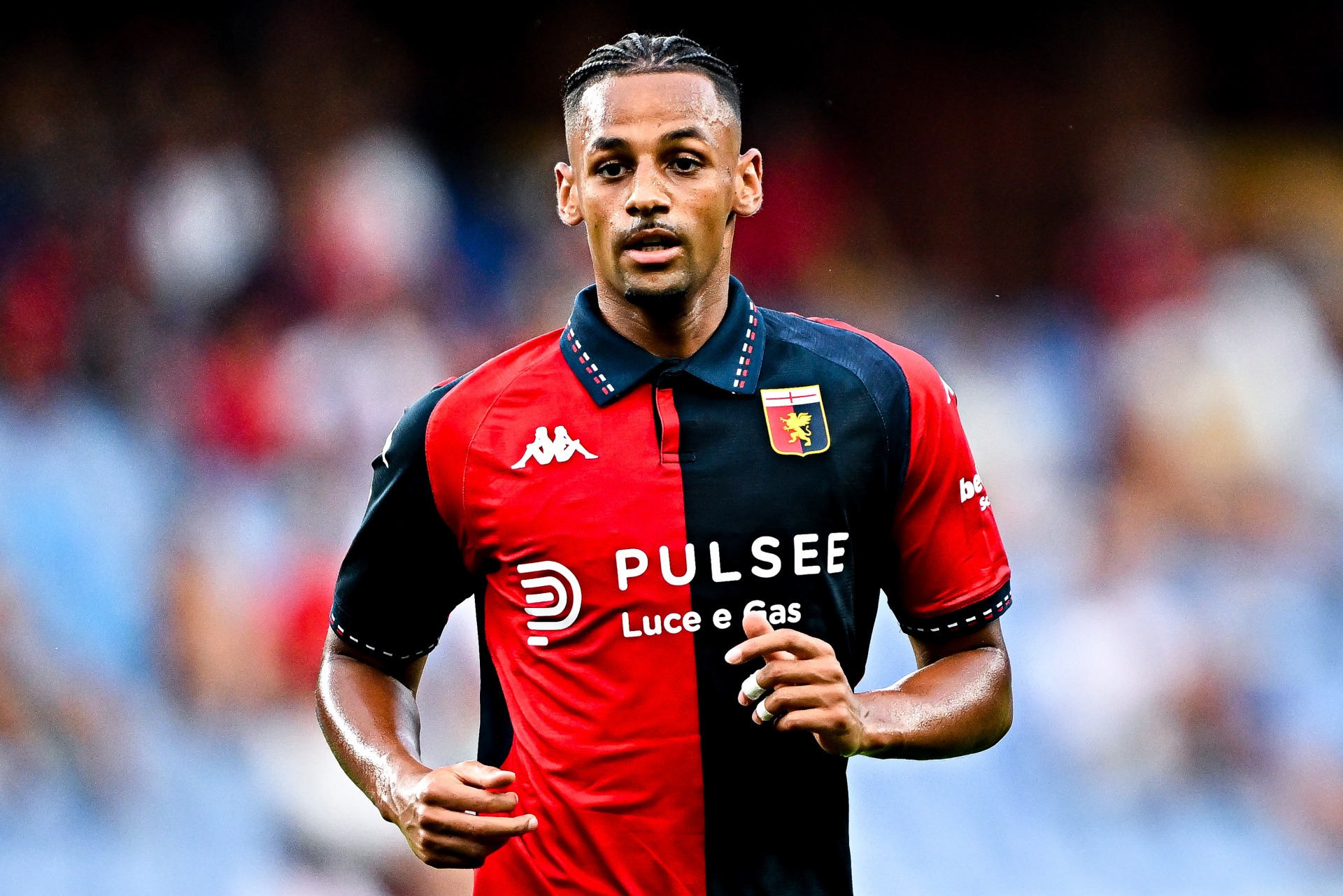
GENOA – Another strong, welcome whiff of nostalgia from the only Kappa kit in the division, as Genoa opt for a retro-style collar (this appears to be very popular this season) and a return to the deeper red and navy blue.
‘You’ll Never Run Alone’ was the message at the launch, in more than a nod to the 1992 UEFA Cup win over Liverpool, with members of the team from that Anfield victory featuring in the promotion.
The Rossoblu have also gone back to the traditional club crest after using a cut-out Griffin last term.
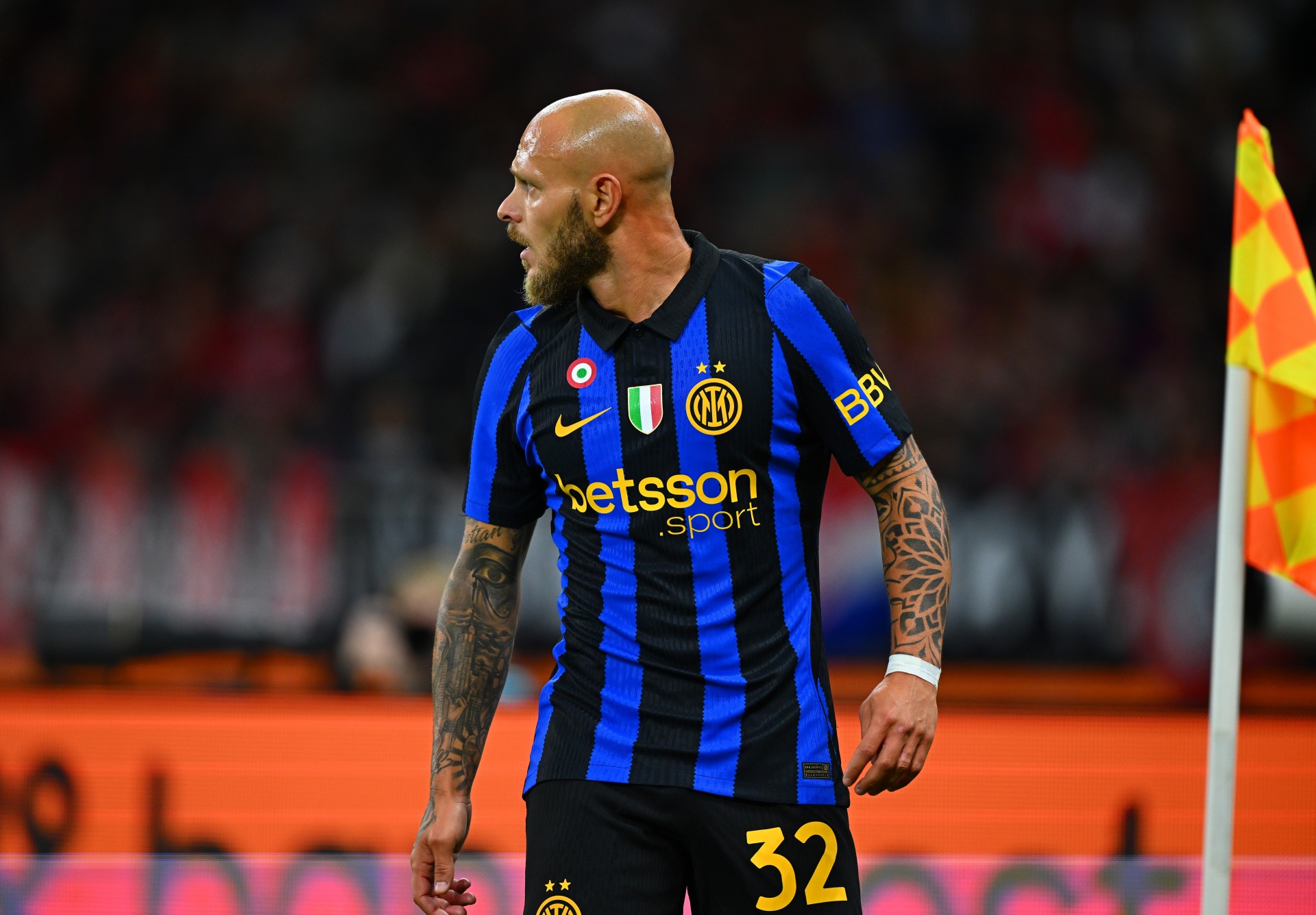
INTER – Like their city rivals AC Milan, Inter have gone back to a more familiar stripe compared to 2025-26.
The black is thicker than the blue and a jagged edge separates them, but this number looks much more like a traditional Inter jersey than last year’s effort.
We also prefer the Nike logo, crest and sponsor in yellow, while the ‘Made of Milano’ message on the inside is a nice fit for a team playing their trade in the world’s fashion capital.
One of just two Nike kits in the division, with Monza also donning the swoosh.
JUVENTUS – Another calcio giant moving back towards basics.
The barcode effect of last season is gone and a more classic Juve look has returned. Gold colouring is also back on the badge, adidas logo and sponsor for the first time in a few years.
‘Heritage roots. Bold future,’ was The Old Lady’s message to her 59 million Instagram followers at the launch, which, compared to some of the teams in the league, was kept fairly simple, with the players getting a first glimpse and giving their verdict.
‘Bellissima’ was the general consensus.
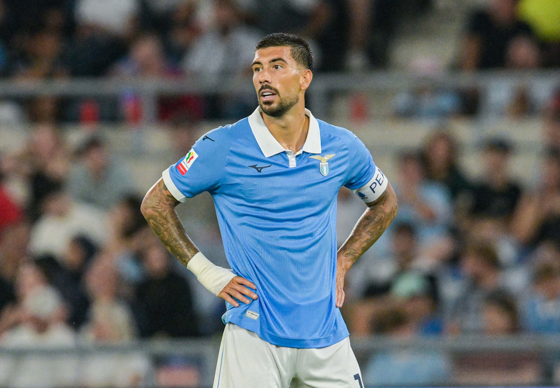
LAZIO – The light blue half of the Italian capital dropped a delicious double when launching their home and third kits at the same time earlier this summer.
We’ll cover the third in another article, but for now we’ll marvel at the stunning sky-blue top. The white collar would have looked great anyway, but the embossed SSL900 to mark the year the club was formed really makes it stand out.
LECCE – The promo shots for the new Lecce kits are unmistakably Italian.
They launched against backdrops of city squares, the sunshine of Puglia, and even inside makeshift Lecce-themed trattorias, where maps of the country and football scarves adorn the walls.
Here, bold colours meet elegant design.
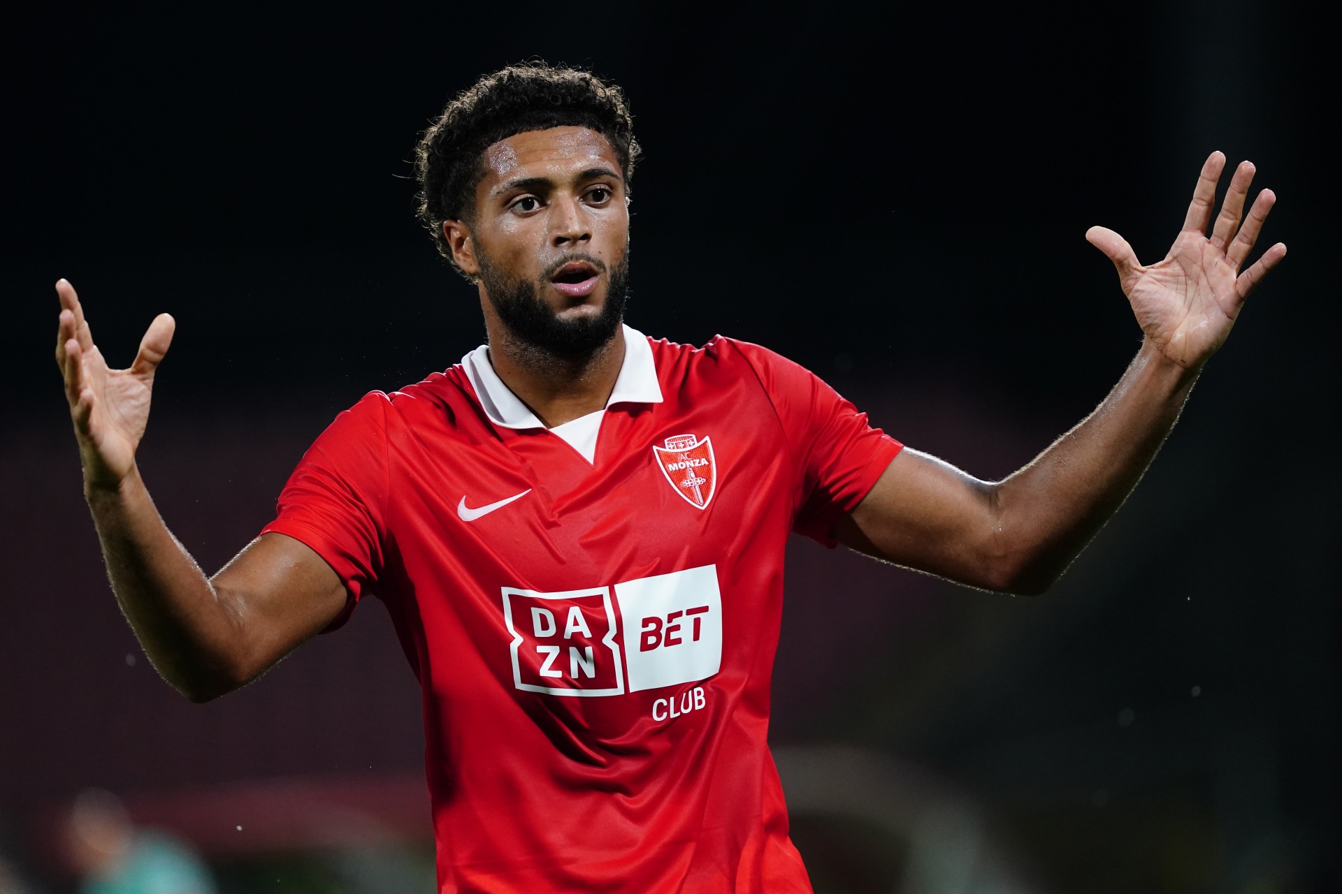
MONZA – Monza have partnered up with Nike to release a sleek and stylish new home kit for their return to Serie A.
The typical red jersey boasts a classic white collar, and it was released in regal fashion with promo shots from landmark locations throughout the Monza and Brianza regions.
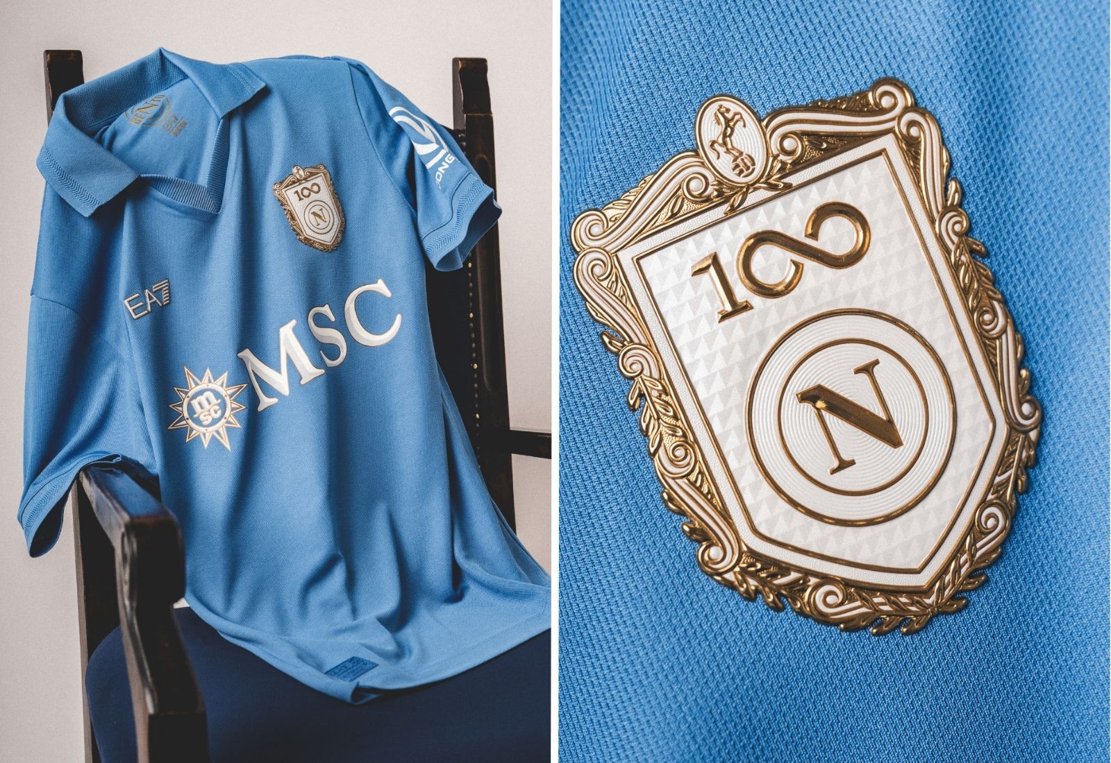
NAPOLI – The club celebrated ‘100 Years of Napoli’ in fine style, unveiling their magnificent new home jersey in centenary blue on board the MSC World Europa.
The kit, with the crest in white and gold for the big anniversary, looks superb, but the best part of the launch has to be the picture they made up of the late Diego Maradona, smiling and wearing it sitting in the stands of the stadium that carries his name.
PARMA – ‘Warm white,’ as Parma and Puma are calling this one, sounds a bit better than off-white, but it is certainly a different white to last term.
Another shake-up we like is the crest standing out on the centre of the black cross, rather than to the left.
This one was unveiled at the city’s university to celebrate younger generations and Parma’s position as European Youth Capital in 2007. If you fancy visiting, the university is within walking distance of the restaurants and bars recommended in our playbook.
ROMA – More red, less wine compared to the home kit from last season, although the shoulders and sleeves do have a drop of claret.
This launch did not centre around one famous landmark in the capital, but instead focused on an idea grounded in the identity of the city: Virtus.
Inno alla Virtus romana – an anthem to Roman virtue – was the cry at the launch, while there is a welcome return for the traditional club crest.

SASSUOLO – They released their new home kit on July 17 to coincide with the club’s 106th anniversary and part of this one takes inspiration from the curva.
The green and black stripes are broad and classy, but with a twist that pays homage to the tifosi. The texture detail in the green parts of the jersey represents the smoke of the bengalos (fans’ flares.)
TORINO – Another club celebrating a big birthday, as Torino hit the grand old age of 120.
At first look, the home kit is very like last season’s but there is an embossed pattern through the jersey, inspired by the flooring of the Basilica of Superga.
That is the symbol that unites the team with the fans and the city, and if you are visiting, it sits on a hilltop outside the city to the north-east.
UDINESE – If you thought Torino were old, all the way across at the other side of northern Italy, Udinese almost make them look like spring chickens.
The team from Udine are celebrating their 130th anniversary. To mark the occasion, manufacturer Macron, in their ninth straight season with the club, have gone back to the traditional black and white stripes.
Rather than stick to the city, the launch took place at Lignano Sabbiadoro, a seaside town on the Adriatic coast, with a view to connecting with and promoting the wider region.

VENEZIA – They’ve done it again. Venezia’s kits over the last decade have put the club on the map, and they continue to deliver.
The home design includes a bold horizontal orange-and-green split chest band, and style is now synonymous with this football club.
NOCTA, the Drake-owned Nike sub-label, is certainly helping with this, and the partnership reached new heights with this launch, unfurling a giant home kit in the city.
Related Topics
Related Articles
Related Articles
All the information on where and when to buy your tickets to watch Livorno in action in one of the third tier's liveliest atmospheres.
Roberto Mancini’s first game back as Italy boss ended in defeat. For one club near Bergamo, though, the result was almost a footnote.
The three brothers all grew up in Castellammare di Stabia, a city around half an hour's drive from Naples.