Venezia is a curious paradox. Based in one of the world’s most unique cities, until a decade ago they had seldom left a mark on the football landscape, in Italy or abroad.
Of course, the likes of future Grande Torino icon Valentino Mazzola made their name with the Arancioneroverdi and Alvaro Recoba’s loan spell by the Lagoon captured the attention of calcio fans over two decades ago.
But in football’s public consciousness, until recently Venezia were best known for playing at the Pier Luigi Penzo, Italy’s second-oldest football ground, behind the Marassi in Genoa. Even then, however, the Penzo’s dated, shabby-chic feel felt like an incongruous juxtaposition with the style and grandeur Venice is known for.
Over the past five years, however, Venezia have become one of the most recognisable clubs on the planet – thanks to their kits.
Kappa replaced Nike as the their manufacturer in 2021 because Venezia reportedly wanted more creative control and used agencies, such as Bureau Borsche, for their releases.
It is a theme that has extended beyond the shirts, with the club notoriously reluctant to engage in social media collaborations. Venice may be welcoming millions of tourists a year, but Venezia do just fine on their own.
Kappa set its stall out immediately. Gone were the bland green, orange and black hoops that marked the swoosh brand’s final season, in came a shirt that immediately became a stone-cold classic.
The club’s name spelt out in gold capital letters where the sponsor would normally sit, with a pattern of gold dots loosely resembling stars shaped into a V, along with the Kappa logo on both sleeves also in gold. All against a black background, with green and orange threads on the neck and sleeves.
The away kit was just as impressive, a repeating triangle pattern changing shades from orange to black and to green against a white background, underneath the wording VENEZIA.
The third kit, meanwhile, featured the club’s three colours appearing as a brush stroke over a light blue background, a nod to the water in the Venetian Lagoon.
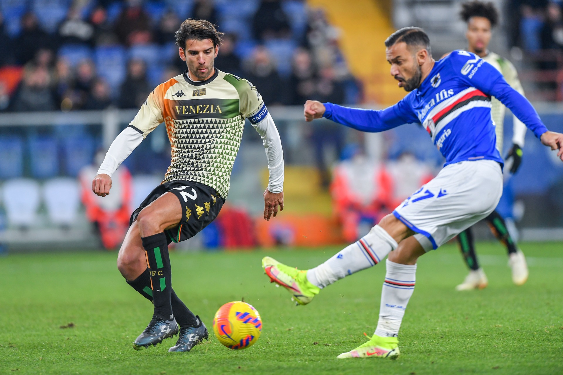
Kappa upped the ante even further the next season, releasing a third kit that was striking in its beauty with a buttoned-up neck, the badge and the Kappa logo the only black exceptions to an otherwise entirely gold background.
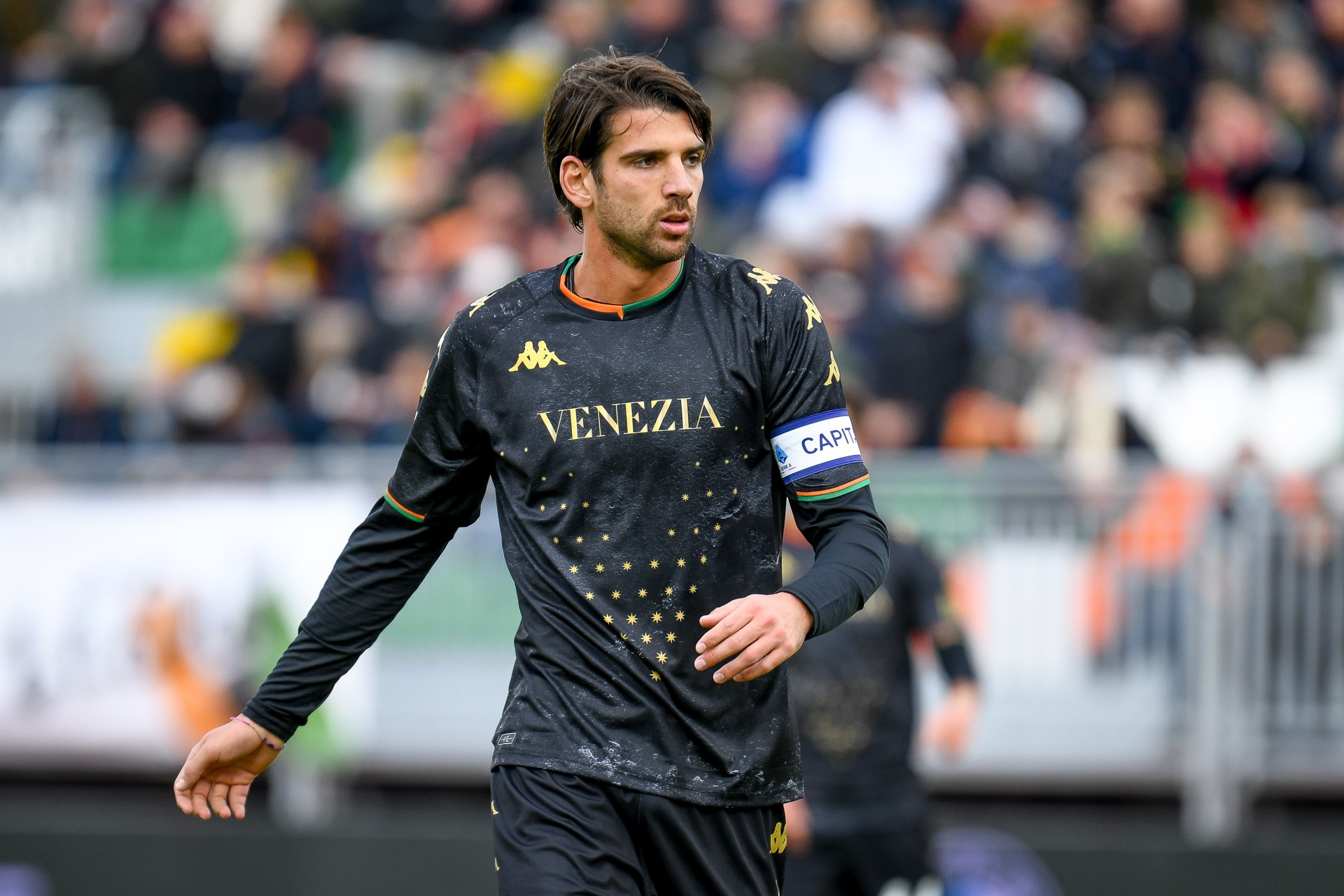
The colour scheme was inverted for the first kit of the 2023-24 campaign, which featured gold trims on the shirts and neck and a gold badge on a black background, with two thin orange and green thin lines running vertically across it. The third kit, however, was an absolute showstopper with black and white hoops and a red collar paying homage to the uniform worn by the Gondolieri over the city’s famous canals.
It wasn’t just the shirts, though.
Under the guidance of then-chief brand officer Ted Philipakos, Venezia turned kit launches into an event.
And as Football Kit Italia author Sam Blair told Destination Calcio last year, the Lagunari were among the first clubs to recognise football shirts could become a statement.
“If you think of some of the fashion shirts that have come out, the collaborations between clubs and designers, we see that quite prominently in Italy,” he explained. “The likes of Venezia and others have really capitalised on the social media exposure these kits give them in terms of leaning into the design.”
A football enthusiast who has collected more than 500 shirts for over three decades, Blair also noted Venezia’s collaborations with Kappa tapped into Italian football’s penchant for eschewing some of the bigger manufacturers in favour of smaller brands.
“The one thing I like about Serie A is just the divergence of manufacturers,” he said. “Some of the big leagues you fall into a pattern with Nike, Adidas and Puma, whereas I think things are different in Italy.
“Macron are doing some amazing stuff. Kappa and the Genoa shirts and then all these smaller clubs, like Como, Venezia they’re all leaning into it.”
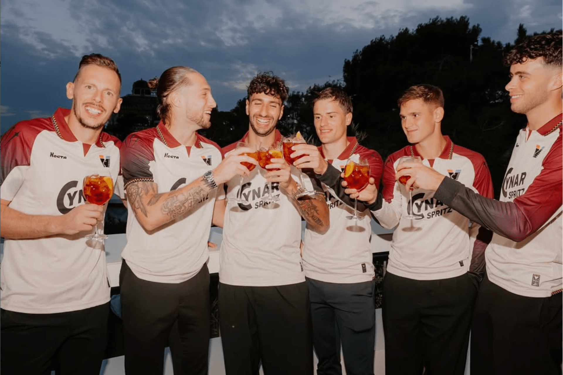
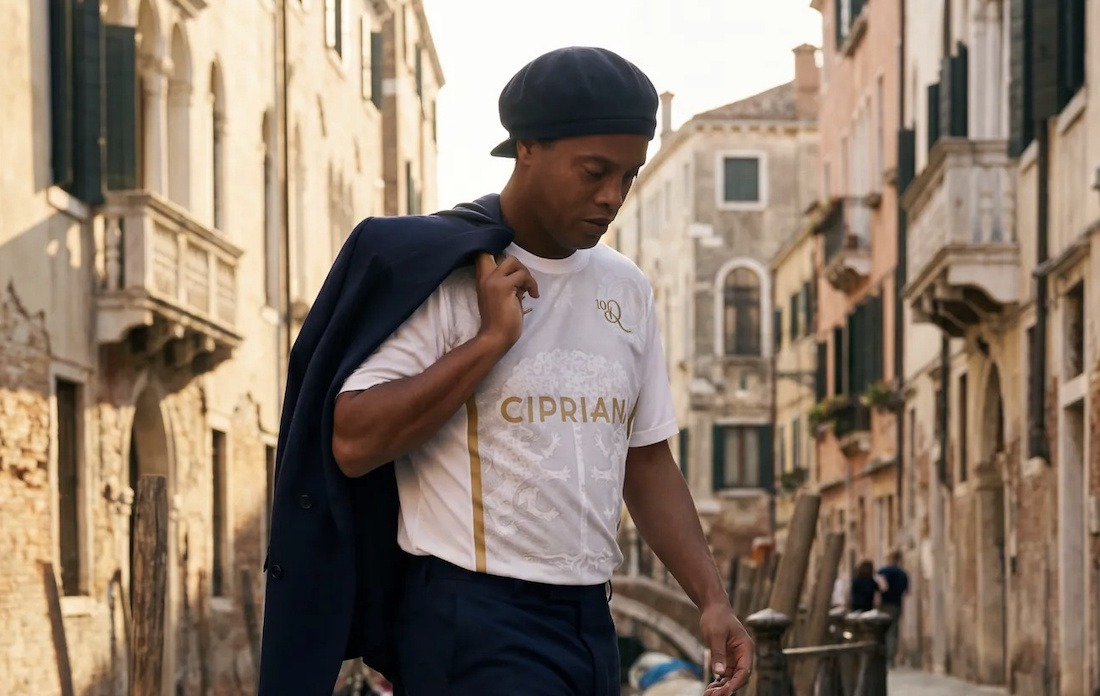
Kappa has since left the Lagoon, but their replacement, NOCTA, has raised Venezia’s profile even more. A Nike sub-label, the brand is owned by global music superstar Drake, who came to the club’s rescue in 2024 when the club the prospect of going bust for the third time in just over a decade.
The Canadian joined global sports-focused firm APEX Capital on the list of investors into the club, with NOCTA becoming the official kit manufacturer.
“Drake’s value to any football club is undeniable, given his scale as a global superstar and the reach of his brand,” Venezia co-owner Brad Katsuyama told GQ Italy at the time.
“This intersection of culture and sport is exactly where we want to be, and the chance to collaborate with a brand like NOCTA, who is moving along the same lines, is incredibly valuable.”
The club said the link-up with NOCTA would “bring international attention to one of the most culturally significant cities in the world and reinforce Venezia’s broader mission to celebrate the city’s cultural heritage.”
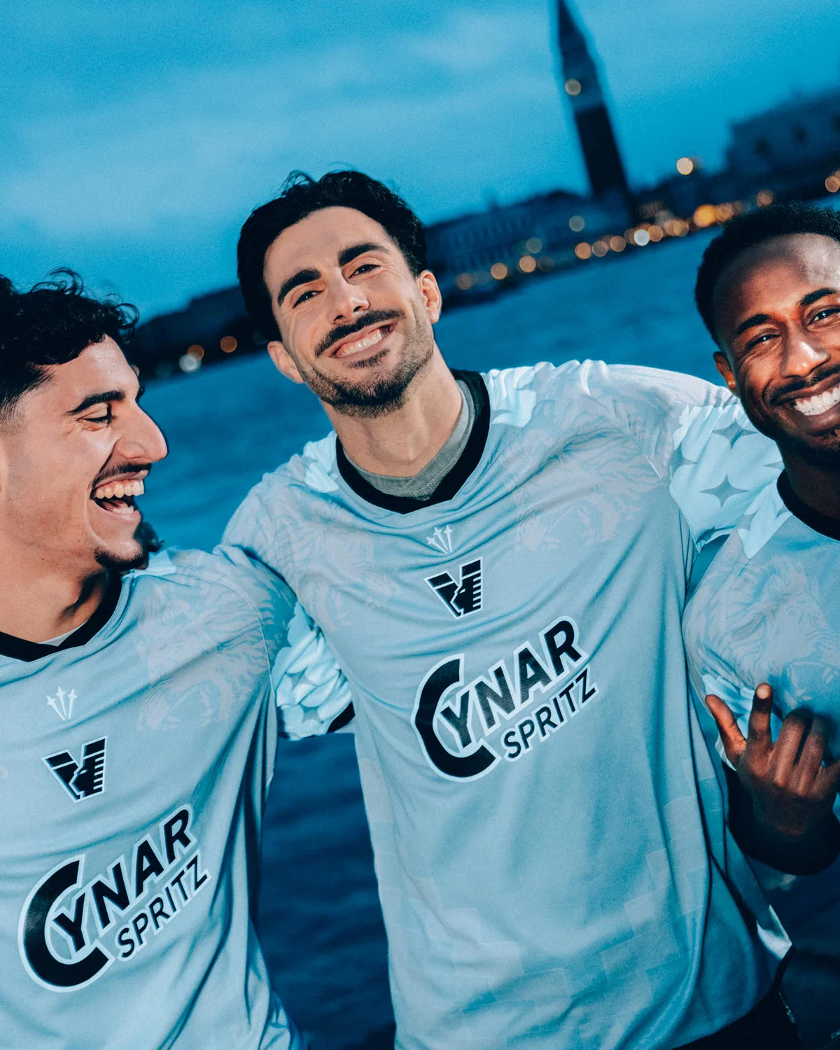
It has since lived up to its promise, using Venice’s iconic Cynar as sponsor and producing a series of absolute stunners.
The most recent, this season’s fourth kit, was designed by Drake Ramberg, the man behind some of the huge Nike numbers in the 1990s and, in an interview with soccerbible.com in December last year, he explained the thinking behind his latest project.
He said: “You can see the brick pattern on the architecture in Venice and that was something that just felt like a signature element, representing Gothic architecture from the city. So that was factored in on the sleeves. It has the Nocta stars subtly. Then the Lion of Saint Mark, as well as the eight pointed stars in gold. I thought those stars were so unique, because most stars you see are five-pointed. This gave it extra meaning.”
Ramberg, who says his favourites are Borussia Dortmund’s home jersey from 1994-95 and the 1995 Arsenal top, away went on: “You have the individual sponsors which tell the joint story but my main interest is always the club and the city and what kind of narrative we can paint from this perspective first and foremost. I’d find it hard to design something that places the manufacturer front and centre. They already have branded-wear for that. Creativity should always be driving-force and everything else should follow. If you’re doing it right then both sides should be elevated.”
The aesthetic of this season’s first shirt is rooted in 15th-century Venetian maps – a deliberate nod to the city’s legacy as a powerhouse of global influence and pioneering thought, while the fourth kit pays homage to the Venetian lagoon along the lines of Kappa’s similar effort from three years ago.
The away kit, if possible, is even better. An off white background with maroon and black sleeves and the old-fashioned club logo shaped into a V with black, orange and green motifs.
After two relegations to Serie B in the past five seasons, Venezia are once again knocking on the door of the Italian top flight. If recent history is anything to go by, they may not stay in Serie A for long, but they will undoubtedly look the part.
Related Topics
Related Articles
Related Articles
Around Italy and up and down the top three divisions, several teams are trying to shake things up in their own way?
A host of young players tipped for the top are back in Serie A for the coming season after loan spells. Here's where to catch them.
Venezia has transformed into an international launching pad that is part of three journeys to the World Cup.